UI Basics 1
Free 3D UI icons: the interface basics
In short
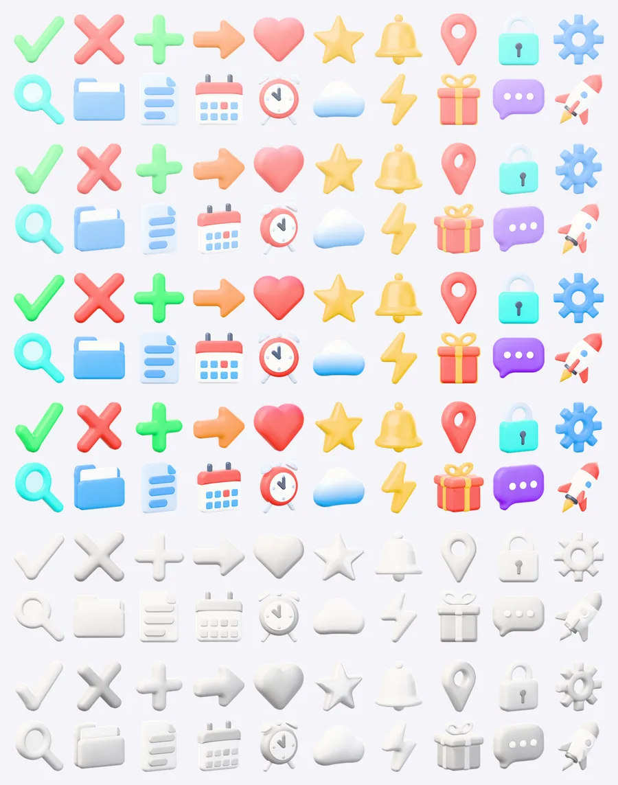
UI Basics 1 is a free CC0 pack of 20 glossy 3D icons for the symbols almost every app needs, from checkmark and x mark to bell, gear, magnifier and calendar. Each icon comes in 3 colour styles and 2 views as transparent PNG at 1024, 512 and 256 px, 360 files in total.
- Icons
- 20
- Colour styles
- Pastel, Vivid, Clay
- Views
- front, angled
- Sizes
- 1024 px, 512 px, 256 px
- Format
- PNG with transparency, 360 files
- License
- CC0 1.0
CC0 1.0 · No account
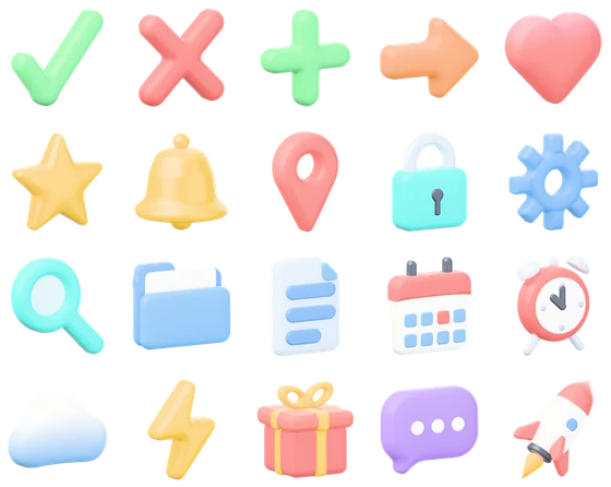
0120 icons in the pack
-
 Checkmark
-
 X mark
-
 Plus
-
 Arrow
-
 Heart
-
 Star
-
 Bell
-
 Location pin
-
 Padlock
-
 Gear
-
 Magnifier
-
 Folder
-
 Document
-
 Calendar
-
 Clock
-
 Cloud
-
 Lightning
-
 Gift
-
 Chat bubble
-
 Rocket
02Rocket in every style and view
256 px files shown at their own size. The same icon slug, style and view make up every file name.

Pastel · front
rocket-pastel-front.png
Pastel · angled
rocket-pastel-angle.png
Vivid · front
rocket-vivid-front.png
Vivid · angled
rocket-vivid-angle.png
Clay · front
rocket-clay-front.png
Clay · angled
rocket-clay-angle.png
Which size for which use, Figma and HTML snippets: 3D icon guide.
03Files and downloads
| Folder | PNG | Size | ZIP |
|---|---|---|---|
| png/1024/ | 120 | 55 MB | full |
| png/512/ | 120 | 11 MB | full and lite |
| png/256/ | 120 | 3.2 MB | full and lite |
- File names
- <icon>-<style>-<view>.png
- Full ZIP
- 3d-icons-ui-basics-1.zip · 70 MB
- Lite ZIP
- 3d-icons-ui-basics-1-lite.zip · 15 MB · 512 and 256 px, LITE.txt
- License
- CC0 1.0 (LICENSE.txt)
04About the pack
This first basics pack covers states and core actions: confirm with the checkmark, cancel with the x mark, add with the plus, move on with the arrow. Heart and star mark favourites and ratings, the bell stands for alerts, the padlock for privacy and the gear for settings. Magnifier, folder and document handle search and files, while calendar and clock carry dates and reminders.
Cloud, lightning, gift, chat bubble and rocket round the set off for onboarding screens and feature highlights, for example sync, speed, rewards, support and launch. The rounded, inflated shapes stay readable at small sizes, so the same icon works as a 64 px list marker and as a large hero image.
Good for
- Empty states, success and error messages
- Settings, search and file screens in apps
- Onboarding slides and feature lists
- Landing page heroes and pricing tables
Questions and answers
Which icons are in UI Basics 1?
20 icons: checkmark, x mark, plus, arrow, heart, star, bell, location pin, padlock, gear, magnifier, folder, document, calendar, clock, cloud, lightning, gift, chat bubble and rocket.
How does UI Basics 1 differ from UI Basics 2?
Pack 1 holds status, favourite and app feature symbols such as bell, heart, gear and calendar. Pack 2 adds controls for toolbars and getting around, such as menu, filter, share, download, pencil, trash and home. No icon appears in both, and both share the same look.
Can I use the checkmark and x mark as status icons in a product?
Yes. The pack is CC0, so the icons may appear in commercial apps, SaaS dashboards and client sites without credit. The vivid style gives the clearest green and red for success and error states.
Is the rocket icon available in a flat front view?
Every icon, the rocket included, ships in a straight front view and in an angled view turned 30 degrees, each in pastel, vivid and clay. That makes 120 PNGs per size for this pack.
More 3D icon packs
All 3D icons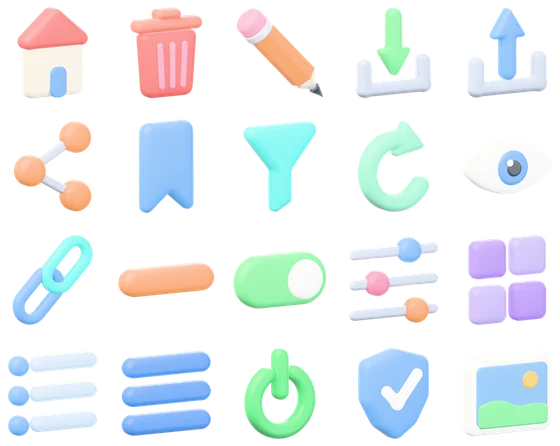
More free 2D assets and textures

Texture categories Wood texturesFabric texturesStone texturesBrick and roof texturesGround texturesConcrete and tile texturesMetal textures