UI Basics 2
3D interface icons for toolbars and navigation
In short
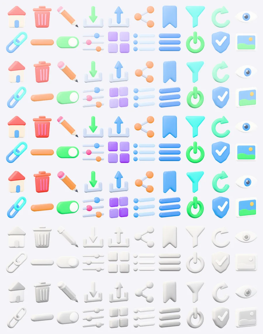
UI Basics 2 is the second free interface pack: 20 3D icons for actions and navigation, such as home, trash, pencil, download, upload, share, filter, refresh, menu and power. All of them are CC0, with square PNG files that run from 1024 down to 256 px, coloured pastel, vivid or clay and shown from the front or at an angle.
- Icons
- 20
- Colour styles
- Pastel, Vivid, Clay
- Views
- front, angled
- Sizes
- 1024 px, 512 px, 256 px
- Format
- PNG with transparency, 360 files
- License
- CC0 1.0
CC0 1.0 · No account
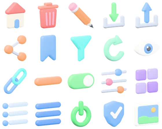
0120 icons in the pack
-
 Home
-
 Trash can
-
 Pencil
-
 Download
-
 Upload
-
 Share
-
 Bookmark
-
 Filter
-
 Refresh
-
 Eye
-
 Link
-
 Minus
-
 Toggle switch
-
 Sliders
-
 Grid
-
 List
-
 Menu
-
 Power button
-
 Shield
-
 Image
02Home in every style and view
256 px files shown at their own size. The same icon slug, style and view make up every file name.
Pastel · front
home-pastel-front.png
Pastel · angled
home-pastel-angle.png
Vivid · front
home-vivid-front.png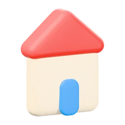
Vivid · angled
home-vivid-angle.png
Clay · front
home-clay-front.png
Clay · angled
home-clay-angle.png
Which size for which use, Figma and HTML snippets: 3D icon guide.
03Files and downloads
| Folder | PNG | Size | ZIP |
|---|---|---|---|
| png/1024/ | 120 | 51 MB | full |
| png/512/ | 120 | 10 MB | full and lite |
| png/256/ | 120 | 2.9 MB | full and lite |
- File names
- <icon>-<style>-<view>.png
- Full ZIP
- 3d-icons-ui-basics-2.zip · 65 MB
- Lite ZIP
- 3d-icons-ui-basics-2-lite.zip · 14 MB · 512 and 256 px, LITE.txt
- License
- CC0 1.0 (LICENSE.txt)
04About the pack
Where pack 1 shows states, pack 2 is about doing things. Pencil, trash and minus edit and remove content, download, upload, share and link move it around, and filter, sliders and refresh tune a view. Eye toggles visibility, toggle switches an option, and shield marks a protected area.
Home, grid, list and menu cover navigation and layout switches, power and image complete the set. Because the shapes are simple, the front view reads almost like a classic flat icon with depth, which suits app bars and sidebars, while the angled view works better in large feature tiles.
Good for
- App bars, tab bars and sidebars
- Editor toolbars and context menus
- Download and share buttons on landing pages
- Settings panels with switches and sliders
Questions and answers
Which controls does UI Basics 2 contain?
20 icons: home, trash can, pencil, download, upload, share, bookmark, filter, refresh, eye, link, minus, toggle switch, sliders, grid, list, menu, power button, shield and image.
Do these icons fit next to UI Basics 1?
They do. Both packs use the same lighting, margins and colour styles, and pack 2 has no duplicates of pack 1. Together they give 40 different interface symbols, for example the plus from pack 1 next to the minus from pack 2.
Which style suits a dark app theme?
Vivid keeps the strongest contrast on dark backgrounds. Clay, the soft white monochrome version, looks calm on mid grey surfaces and in wireframes, and pastel fits light themes.
Are download and upload separate icons?
Yes, each has its own model with the arrow pointing down or up, so neither needs to be mirrored. Like the other 18 icons they come at 1024, 512 and 256 px.
More 3D icon packs
All 3D icons
More free 2D assets and textures

Texture categories Wood texturesFabric texturesStone texturesBrick and roof texturesGround texturesConcrete and tile texturesMetal textures